top of page
Invite Top
Corporate Identity


Carow
HEALTHCARE CONSULTING
Client: Carow Consulting
Carow Consulting works with healthcare organizations to identify needs, research and analyze factors impacting growth and performance, and collaboratively develops solutions to drive change.
To demonstrate Carow's creative techniques the two "C"s in Carow's logo represent different approaches to the same issue, curved edges provide another unusual element to support Carow's out-of-the-box strategies. Earthy and eye-catching colors and graphics allow the CC identity to stand out among other businesses working in the heathcare industry.
Quantity: various

GoingHome
COMMUNITY SERVICE LOGO
Client: Going Home /
The Arc of Illinois
The Arc of Illinois' Going Home program provides unique community-based full-living homes for developmentally disabled, bringing them into the world rather than shutting them out. The logo was developed to bring public and governmental recognition and awareness to the program through print, web, and community action endeavors.
Quantity: various

CSS
DESIGN • BUILD • MANAGE
Client: Chicago Scenic Studios
A contemporary Vitruvian Man, Chicago Scenic Studios logo builds on geometric forms and the solid yet versatile structure suggests creativity. Creating excitement and showcasing their abilities to design, build and/or manage projects. Applied to stationery, marketing, signage.

HOSPITAL CLAIM RESOLUTION SOFTWARE STARTUP
Client: Structured Analytics
A startup software company focused on getting hospitals the best claim resolution possible through use of analytics. An upbeat clean look and color palette encourages a positive outlook to claims resolution.
Quantity: 500

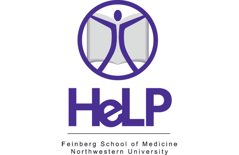
HELP IN HEALTH LITERACY
Client: Northwestern University's Health Literacy and Learning Program Logo
Northwestern is the first institution in the country to link the fields of medicine and education in order to improve how health systems educate patients and families on their health through information learning sessions on health promotion and empowerment
with HeLP.
Language, visual, and verbal clues are key to learning how to communicate with health care professionals. A clean and simple logo demonstrating the ability to connect with information and feel empowered by that ability were key to developing this identity.
Quantity: various
SA
HELP
WESTSIDE HEALTH AUTHORITY BRAND IDENTITY
Client: Westside Health Authority
The Westside Health Authority (WHA) is a non-profit organization in the Austin neighborhood of Chicago, focused on offering community residents the means to support themselves through community action and activity.
"Every block a village," the motivational slogan of the WHA, was the inspiration for the WHA logo graphic, an abstraction of buildings and blocks, of individuals, neighborhoods, and community. Alternative colors were provided to add freshness and flexibility to the WHA logo.
Quantity: various applications

WHA
bottom of page